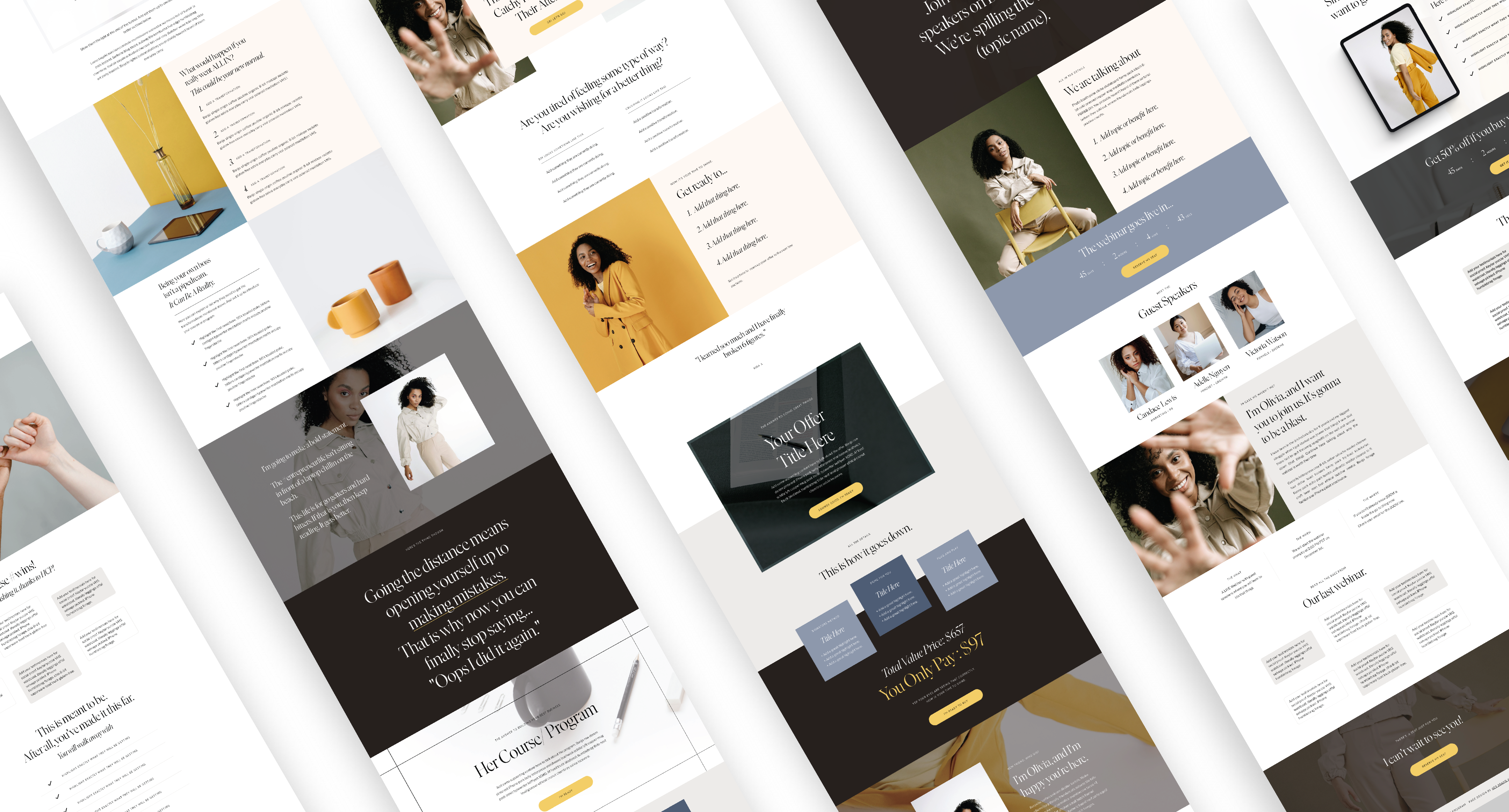
Have you ever wondered why your sales pages leave visitors scratching their heads about whether they should or shouldn’t punch in their credit card? It simply comes down to structure. That’s why you need the sales page blueprint to increase sales and conversions. In this super detailed post, we are peeling back every layer of a converting sales page, offering insights into the artistry that turns casual browsers into committed customers. Ready to increase your sales & conversions? Let’s go!
1. Irresistible Headline: The Gateway to Conversion
The journey begins with an attention-grabbing headline. It should be clear, compelling, and promise value. Think of it as the front door to your sales pitch—make it inviting and impossible to ignore.

2. Engaging Visuals: A Picture is Worth a Thousand Sales
Humans are visual creatures. Incorporate high-quality images, infographics, and perhaps a captivating video to bring your product or service to life. Visuals not only enhance understanding but also evoke emotions, a key ingredient for successful sales.

3. Compelling Copy: The Art of Persuasion
Craft a compelling narrative that speaks directly to your audience’s pain points and desires. Use persuasive language, highlight benefits, and sprinkle in some testimonials for that extra trust factor. Remember, it’s not just about selling a product; it’s about offering a solution.

4. Features and Benefits: The Dynamic Duo
Break down your product or service into features and the corresponding benefits. Features explain what it is, while benefits reveal why it matters to your audience. Show them how your offering will make their lives better, easier, or more enjoyable.

5. Social Proof: Because Trust is Everything
Include customer testimonials, reviews, or case studies to build trust. Real stories from real people act as powerful endorsements, reassuring potential customers that they’re making a wise decision.

6. Clear Call to Action (CTA): Guide the Way
What do you want your visitors to do? Whether it’s making a purchase, signing up, or downloading a guide, your CTA should be clear, compelling, and strategically placed. Make it easy for them to take the next step.

7. Limited-Time Offers: Create Urgency
Encourage action by incorporating limited-time offers, discounts, or exclusive deals. Urgency and scarcity can nudge fence-sitters toward making a decision.

8. Risk Reversal: The Safety Net
Address potential objections and offer a guarantee. Whether it’s a money-back guarantee or a free trial, removing the perceived risk can be the tipping point for hesitant buyers.

9. FAQ Section: Proactive Answers
Anticipate questions and objections by including a well-crafted FAQ section. This demonstrates transparency and saves potential customers the trouble of hunting for information.

10. Responsive Design: A Seamless Experience
Ensure your sales page is mobile-friendly and visually appealing across all devices. A seamless experience enhances user satisfaction and boosts conversions.
So that’s a wrap on the Sales Page Blueprint To Increase Sales and Conversions. Now that we’ve unpacked the essentials, it’s time to put theory into action. If you’re ready to elevate your sales page game, why not check out Her Sales Bundle, a collection of sales page and marketing web templates?
- Evergreen Sales Page
- Standard Sales Page
- Mini Sales Page (download for free)
- Opt-in Landing Short
- Opt-in Landing Long
- Thank Your Short
- Thank You Long
- Waitlist Page 1
- Waitlist Page 2
- Tripwire Page
- Webinar Page
Her Sales Bundle is designed for maximum impact and easy customization, these templates can have you up and running in no time. I’m sure you have noticed all the screenshots throughout this whole post. Visit our template shop and see Her Sales Bundle for yourself.
But of course, there is always more! If you want to have one of the pages for FREE click below to get the Mini Sales Page.


Share It!