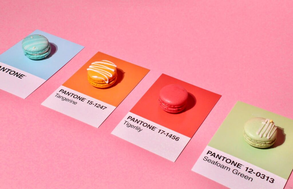
Color psychology may seem like an insignificant branding piece but believe it or not, there’s actual science behind why certain colors make us feel a certain way. It’s like the secret language of emotions, all hidden in the spectrum. For instance:
- Red: The fiery color of passion and energy. It’s the brand color for those who want to make a bold statement. Think Coca-Cola.
- Blue: Cool, calm, and collected. Blue is the color of trust and reliability. Look at IBM for a prime example.
- Yellow: The sunshine color. It’s all about optimism and warmth. Hello, McDonald’s!
- Green: The color of nature and growth. It screams eco-friendliness and health, just like Whole Foods.
- Purple: The regal hue. It represents luxury and sophistication. Think Cadbury.
- Orange: Energetic and fun, orange is all about enthusiasm. It’s the color of Nickelodeon.
- Black: The epitome of sophistication and mystery. Think Chanel.
- White: The clean slate. It’s about simplicity and purity, like Apple.

So, before you go picking colors willy-nilly, think about what emotions you want your brand to evoke. The Rule of Three: Harmony in Trios
Now, don’t go overboard. You don’t need a dozen colors to tell your story. Sticking to a color trio is like having the perfect recipe. It’s enough to create harmony and variety without overwhelming your audience.
Consider the three-color combo of primary, secondary, and accent colors. For example:
- Primary: The big player, your brand’s identity. It’s the color that dominates your website, logo, and marketing materials.
- Secondary: This one supports the primary, providing a bit of variety and contrast. It often complements the primary color.
- Accent: The spice! Use it sparingly to draw attention to specific elements, like buttons or calls to action.
Consistency is… Wait for It… Key!
Consistency is like the unsung hero of branding. Stick to your chosen colors like glue. If one of your brand’s colors is blue. It should be the same blue used on your website, Instagram posts, and even your cat videos. Just kidding but If you are choosing your own colors or a designer is doing it for you then be sure to know your HEX codes.
So if you scratching you head wondering what the heck a HEX code is I got you. Simply put HEX codes are HTML codes that use a combo of 6 numbers and letters to pinpoint an exact color.
Color Wrap
Congratulations, you’ve just embarked on a colorful journey through the intricate palette of emotions and brand identity. As we’ve uncovered, each color isn’t just a visual spectacle; it’s a strategic choice that speaks the language of emotions. Red sparks passion, blue fosters trust, and yellow radiates optimism. Remember Coca-Cola’s fiery red, IBM’s calming blue, or McDonald’s sunny yellow? These are not random choices; they’re deliberate selections aimed at evoking specific feelings.
If you want to learn more tips about branding check this other post


Share It!